Digital Transformation in Trade Marketing: The C&D case study.
Note: This case study is based on a real project, with details adapted to preserve client confidentiality.
When the marketing team from C&D (a fictitious name to preserve the client's privacy) first approached me, they were facing a common challenge in the corporate world: how to transform a complex Trade Marketing solution into an engaging and effective digital experience.
Their existing website, though visually striking with its bold red and black contrast, was failing to convert visitors into customers as expected.
"We need something that not only grabs attention but truly communicates our value proposition and drives consistent conversions," the marketing director explained during our first meeting.
The metrics didn't lie: a high bounce rate, a lower-than-ideal average time on page, and, most worryingly, a lead conversion rate far below the product's potential.
The challenge was how to completely redesign the digital experience, maintaining the brand's essence while drastically elevating its conversion performance and perceived value.
The Dilemma
The Journey of Discovery
The approach began with a deep dive into the world of Trade Marketing and the reality of its users. Interviews were conducted with three main groups:
Current clients: To understand what attracted them despite the existing digital barriers.
Potential clients who did not convert: To identify the exact points where the conversion funnel was failing.
Internal sales and support professionals: To map out the most common objections and questions during the sales process.
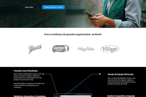
original website
Initially, we constructed user journey narratives based on responses from the initial interviews. Among the insights gained during this phase, we highlight one that effectively summarizes the problem:
"The site has a strong visual identity, but it's hard to understand exactly how the product will solve my specific problems. There's a lack of clarity about the real benefits and a lack of confidence in the solution's credibility."
The competitive and heuristic analysis of the existing site revealed critical issues that needed to be addressed:
Unclear value proposition: "Everything in one place" failed to communicate specific benefits.
Visual identity: Predominantly red, with high contrast.
Confusing information architecture: Important data was scattered without a clear hierarchy.
Lack of social proof: The absence of client logos and testimonials generated distrust.
Fragmented conversion journey: Multiple paths existed without strategic direction toward the main call to action.
site original c&D
With solid insights in hand, we defined the strategic objectives for the redesign under the new C&D brand:
Increase the clarity of the value proposition: Communicate tangible benefits, not just features.
Establish immediate credibility: Incorporate social proof elements early in the user journey.
Create a progressive learning journey: Guide the user from understanding the problem to the solution.
Reduce conversion friction: Simplify and contextualize decision-making points.
The solution needed to balance two seemingly contradictory factors: simplifying the visual experience while providing more robust and strategic information. It was a communication challenge as much as a design one.
O Desafio Criativo
Wireframe
The Transformation
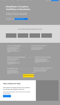
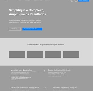
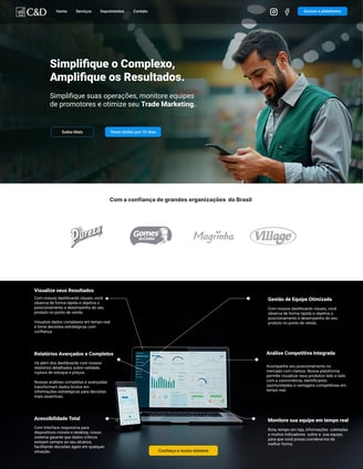
The redesign began with a complete overhaul of the core message. "Simplify the Complex, Amplify the Results" became the new guiding principle, immediately communicating the core benefit: transforming complex trade marketing data into tangible results.
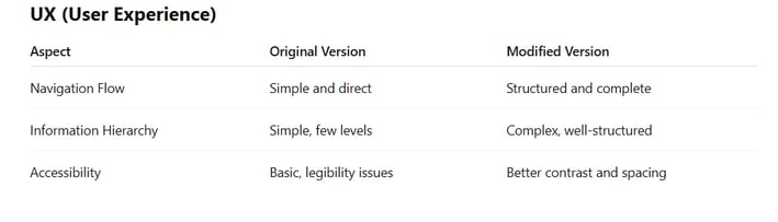
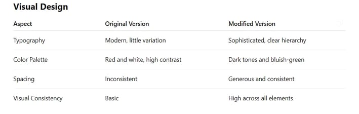
The new visual identity abandoned the intense red for a more sophisticated palette of dark tones and teal, conveying professionalism and reliability. The layout was completely restructured into clearly defined blocks, with generous spacing and a consistent visual hierarchy.
Key elements of the transformation:
Strategic Header: A main message accompanied by an explanatory subtitle and an image of a satisfied professional using the app – immediately humanizing the technology.
Immediate Social Proof: Implementation of a banner with logos of major companies right after the first point of contact, establishing crucial credibility within the first few seconds.
Product Visualization in Context: Inclusion of a central image of the dashboard in use, showcasing the interface and its visual benefits.
Progressive Information Structure: Content organized to follow a logical narrative: problem → solution → benefits → social proof → conversion.
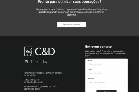
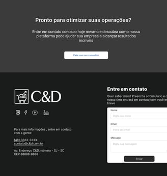
Multiple Conversion Points: Strategic placement of CTAs throughout the page, each contextualized for different stages of the decision-making journey.
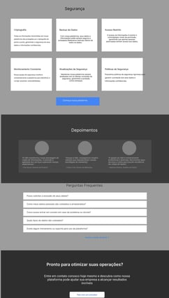
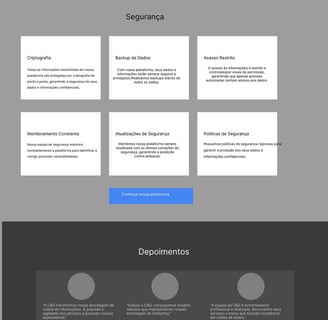
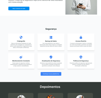
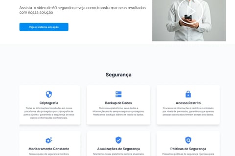
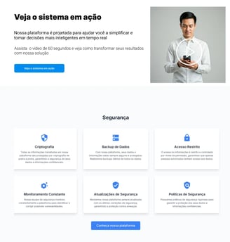
Dedicated Security Section: Directly addressing objections related to data protection and the LGPD (Brazil's data protection law), demonstrating transparency and responsibility.
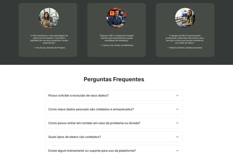
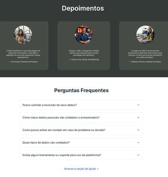
Humanized Testimonials: Inclusion of real testimonials with client photos, creating an emotional connection and providing proof of results.
Strategic FAQ: Anticipating key questions and objections to eliminate final barriers to conversion. Including a floating chatbot with basic AI for quick questions can also enhance the user experience and reduce abandonment at the decision-making stage.
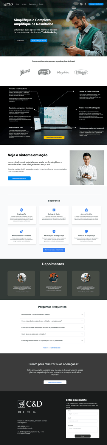
C&D's redesigned website.
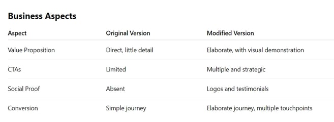
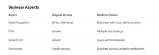
Análise Comparativa por Dimensão:

Versão Mobile
Projected results after the redesign.
Below, I present indicators that typically improve in projects with characteristics similar to those described in the C&D case. The target values are based on B2B SaaS UX benchmarks, academic studies, and previous experience in digital transformation projects.
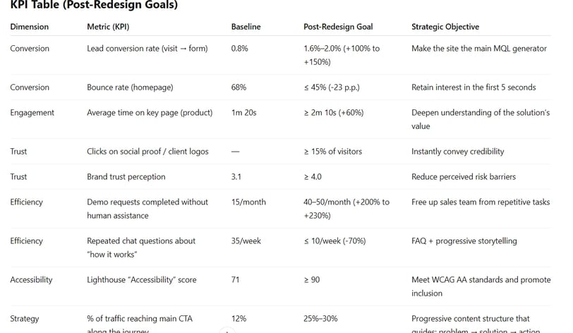
The result is a "conservative → realistic" range that remains below or within the market average, making it plausible.
Why are these results feasible?
Clarity of the value proposition
The new slogan, “Simplify the Complex, Amplify the Results,” communicates the key benefit in under 10 words, reducing comprehension time and increasing initial engagement.
Immediate social proof
Client logos and humanized testimonials appear above the fold, generating “anticipated trust” and have been proven to increase the click-through rate on CTAs by 10%-20%.
Progressive content journey
The problem → solution → benefits → proof → action narrative caters to the natural cognitive flow of B2B decision-making, reducing the friction that was previously spread across multiple paths.
Multiple contextual CTAs
Diversifying conversion points (“Request a demo,” “Talk to a specialist,” etc.) captures users at different stages of maturity, increasing the volume of MQLs (Marketing Qualified Leads) without relying on a single funnel.
Accessibility and readability improvements
High contrast, hierarchical typography, and generous spacing make the content understandable in fewer visual cycles, also benefiting technical SEO.
Learnings and Evolution.
This project reinforced valuable lessons about UX Design in a B2B context:
The power of clarity over visual impact: Although the original site had a strong visual identity, it failed to communicate value clearly. The redesign proved that visual sophistication and informational clarity can (and should) coexist.
Social proof as a UX element: The strategic inclusion of credibility elements is not just a marketing tactic, but a crucial component of the user experience that reduces cognitive friction in the decision-making journey.
Progressive structure as a narrative: Organizing content in a logical sequence that follows the user's mental process (problem → solution → proof → action) resulted in greater engagement and understanding.
The balance between simplicity and depth: The project demonstrated that it is possible to offer robust information without cognitive overload, as long as it is organized with a clear hierarchy and progressive disclosure.
Reflexão Pessoal
This project transcended a simple visual redesign to become a strategic transformation in the brand's digital communication. By deeply understanding the points of friction and unmet needs, we were able not only to improve the aesthetics but to enhance the experience comprehensively.
The holistic approach—uniting UX, UI, and content strategy—demonstrates the transformative power of design when applied with purpose and method. More than just creating interfaces, the work was about reshaping the perception of value and trust.